
SNOW Contemporary HP: http://snowcontemporary.com/index.html
-

“Circulation” / 『Circulation』
¥1,100
カタログ Circulation 仕様 : A5サイズ、表紙+48ページ、カラー 価格 : 1,100円(税込) 作品 : 原口典之 文 : 土屋誠一 翻訳 : 河西香奈 編集 : 窪田研二、斉藤桃加、菅野真那未 アートディレクション&デザイン : 古平正義(FLAME) 撮影: 木奥惠三 発行 : SNOW Contemporary *展覧会展示風景は、カタログに掲載されておりません。/ The exhibition view is not posted in this catalogue. ■原口典之 / 展覧会 「Circulation」より抜粋 日本における1970年代以降の現代美術のムーヴメントにおいて、代表的アーティストとして活躍していた原口ですが、没年の2020年に胃癌の余命宣告を受けます。 余命宣告を受けた原口は、作品発表の予定を目指すわけでもなく、限りのある生において、ほぼ毎日のようにミニマルな平面作品を手掛け、没するまでの3か月ほどの日々の中で、総数100点以上にものぼる作品を遺しました。 作品制作中の原口は、コンポジションを検討し、シンプルな形態が平面上に実現され、作品が完成する都度、岩手県北上市にある彼のスタジオ兼自宅の中庭において、原口とそのパートナーのためだけの「個展」が、毎日のように開かれたといいます。 それは、彼岸へと向かう残された生命のうちの格闘というよりもむしろ、形式上において終わりなき循環(circulation)へと向かう、生命感に満ち溢れた営みであったようにすら、理解が可能であるようにもみえます。 本展覧会は、国際的にも知名度の高い、この稀有な美術家の最後の日々の営みを、展覧会においてできるだけ忠実に再現することを目指します。会期中は、2週間ごとに展示作品をすべて入れ替えることによって、時間の経過ごとにまったく異なる相貌を見せる空間をつくりあげます。そこでは、原口の最晩年の仕事を通じて、終わりなき生の循環という、オープンエンドな芸術作品の可能性が展望できるでしょう。 本展覧会は、この歴史的に重要な足跡を残した美術家である原口が、どのような芸術のヴィジョンを開示しようとしていたのか、原口の没後5年をきっかけに、その再考のための導入になることを願うものです。 *掲載作品に関しては下記までお問い合わせください。 http://snowcontemporary.com/contact.html [Catalogue] Specifications: A5 size, cover + 48 pages, color Works by Noriyuki Haraguchi Essay by Seiichi Tsuchiya Translated by Kana Kawanishi Edited by Kenji Kubota, Momoka Saito and Manami Kanno Art Direction and Design by Masayoshi Kodaira, FLAME inc. Photo by Keizo Kioku Issued by SNOW Contemporary ■ Exhibition - Excerpt from "Circulation" Haraguchi was a prominent artist in Japan's contemporary art scene in the 1970s and beyond, but in 2020, the year he died, he was diagnosed with terminal stomach cancer. After receiving his diagnosis, Haraguchi did not aim to exhibit his works, but instead dedicated his limited time to creating minimalist two-dimensional works almost every day, leaving behind more than 100 works in the three months before his death. During the creation of his works, Haraguchi would consider the composition, and as each piece was finished, a “solo exhibition” was held almost daily in the courtyard of his studio and home in Kitakami City, Iwate Prefecture, exclusively for Haraguchi and his partner. This seems to be understood not so much as a struggle with the remaining life heading toward the afterlife, but rather as a life-filled pursuit heading toward an endless circulation in form. This exhibition seeks to accurately reproduce as faithfully as possible the final days of this rare artist, who is widely recognized internationally. Throughout the exhibition, all works on display will be replaced every two weeks, creating a space that transforms significantly over time. Through Haraguchi's later works, visitors can glimpse the possibilities of open-ended artworks that depict the endless cycle of life. To commemorate the 5th anniversary of his death, this exhibition seeks to delve into Haraguchi's artistic vision, an artist who made a notable impact on history, in the hope that it may inspire a re-evaluation of his work and serve as an introduction. *for more information http://snowcontemporary.com/artist/haraguchi_noriyuki.html *Please feel free to ask us about the artworks shown in the catalogue. http://snowcontemporary.com/en/contact.html Please do not proceed with the payment if you live outside of the EMS transportable area (https://www.post.japanpost.jp/int/ems/country/all_en.html). Please let us know the address to be shipped and contact "[email protected]" first for the estimate of the shipment fee. Import duties and taxes may be applied upon customs clearance into your country. In such cases, the recipient of the item will be responsible for those fees. Please pay these costs directly to the delivery agents or the customs office upon delivery. Additionally, taxes and duties differ by country. Please contact the customs office in your country for details.
-

Silent mountain / 音がしない山
¥330,000
title:Silent mountain / 音がしない山 artist:SHU YONEZAWA / 米澤 柊 year:2023 media:Inkjet print / インクジェットプリント ED : 5 size:103 x 72.8 cm *本作品は店頭併売品につき、品切れの場合にはご注文をキャンセルさせて頂く場合がございます。予めご了承ください。 *配送方法について、こちらから指定させていただく場合がございますので予めご了承ください。 1999年 東京都生まれ。 アーティスト、アニメーター。現在のデジタルアニメーションにおけるキャラクターの身体性と、現実空間の生き物が持っている心の身体性と感情について、またそれらアニメーションが生きる空間の空気を制作している。 Born in Tokyo in 1999. Artist and animator. Interested in the physicality of characters in today’s digital animation and the physicality of the mind and emotions of living creatures in real space. Also creates the atmosphere of the space in which these animations live. for more information : http://snowcontemporary.com/artist/yonezawa_shu.html Please do not proceed with the payment if you live outside of the EMS transportable area (https://www.post.japanpost.jp/int/ems/country/all_en.html). Please let us know the address to be shipped and contact "[email protected]" first for the estimate of the shipment fee. Import duties and taxes may be applied upon customs clearance into your country. In such cases, the recipient of the item will be responsible for those fees. Please pay these costs directly to the delivery agents or the customs office upon delivery. Additionally, taxes and duties differ by country. Please contact the customs office in your country for details.
-

Swimming angel / 泳いでる天使
¥330,000
title:Swimming angel / 泳いでる天使 artist:SHU YONEZAWA / 米澤 柊 year:2023 media:Inkjet print / インクジェットプリント ED : 5 size:72.8 x 103 cm *本作品は店頭併売品につき、品切れの場合にはご注文をキャンセルさせて頂く場合がございます。予めご了承ください。 *配送方法について、こちらから指定させていただく場合がございますので予めご了承ください。 1999年 東京都生まれ。 アーティスト、アニメーター。現在のデジタルアニメーションにおけるキャラクターの身体性と、現実空間の生き物が持っている心の身体性と感情について、またそれらアニメーションが生きる空間の空気を制作している。 Born in Tokyo in 1999. Artist and animator. Interested in the physicality of characters in today’s digital animation and the physicality of the mind and emotions of living creatures in real space. Also creates the atmosphere of the space in which these animations live. for more information : http://snowcontemporary.com/artist/yonezawa_shu.html Please do not proceed with the payment if you live outside of the EMS transportable area (https://www.post.japanpost.jp/int/ems/country/all_en.html). Please let us know the address to be shipped and contact "[email protected]" first for the estimate of the shipment fee. Import duties and taxes may be applied upon customs clearance into your country. In such cases, the recipient of the item will be responsible for those fees. Please pay these costs directly to the delivery agents or the customs office upon delivery. Additionally, taxes and duties differ by country. Please contact the customs office in your country for details.
-

After the typhoon / 台風のあと
¥198,000
title:After the typhoon / 台風のあと artist:SHU YONEZAWA / 米澤 柊 year:2023 media:Inkjet print / インクジェットプリント ED : 5 size:72.8 x 51.5 cm *本作品は店頭併売品につき、品切れの場合にはご注文をキャンセルさせて頂く場合がございます。予めご了承ください。 1999年 東京都生まれ。 アーティスト、アニメーター。現在のデジタルアニメーションにおけるキャラクターの身体性と、現実空間の生き物が持っている心の身体性と感情について、またそれらアニメーションが生きる空間の空気を制作している。 Born in Tokyo in 1999. Artist and animator. Interested in the physicality of characters in today’s digital animation and the physicality of the mind and emotions of living creatures in real space. Also creates the atmosphere of the space in which these animations live. for more information : http://snowcontemporary.com/artist/yonezawa_shu.html Please do not proceed with the payment if you live outside of the EMS transportable area (https://www.post.japanpost.jp/int/ems/country/all_en.html). Please let us know the address to be shipped and contact "[email protected]" first for the estimate of the shipment fee. Import duties and taxes may be applied upon customs clearance into your country. In such cases, the recipient of the item will be responsible for those fees. Please pay these costs directly to the delivery agents or the customs office upon delivery. Additionally, taxes and duties differ by country. Please contact the customs office in your country for details.
-

See you again / 再会
¥198,000
title:See you again / 再会 artist:SHU YONEZAWA / 米澤 柊 year:2023 media:Inkjet print / インクジェットプリント ED : 5 size:72.8 x 51.5 cm *本作品は店頭併売品につき、品切れの場合にはご注文をキャンセルさせて頂く場合がございます。予めご了承ください。 1999年 東京都生まれ。 アーティスト、アニメーター。現在のデジタルアニメーションにおけるキャラクターの身体性と、現実空間の生き物が持っている心の身体性と感情について、またそれらアニメーションが生きる空間の空気を制作している。 Born in Tokyo in 1999. Artist and animator. Interested in the physicality of characters in today’s digital animation and the physicality of the mind and emotions of living creatures in real space. Also creates the atmosphere of the space in which these animations live. for more information : http://snowcontemporary.com/artist/yonezawa_shu.html Please do not proceed with the payment if you live outside of the EMS transportable area (https://www.post.japanpost.jp/int/ems/country/all_en.html). Please let us know the address to be shipped and contact "[email protected]" first for the estimate of the shipment fee. Import duties and taxes may be applied upon customs clearance into your country. In such cases, the recipient of the item will be responsible for those fees. Please pay these costs directly to the delivery agents or the customs office upon delivery. Additionally, taxes and duties differ by country. Please contact the customs office in your country for details.
-

Good night / おやすみ
¥198,000
title:Good night / おやすみ artist:SHU YONEZAWA / 米澤 柊 year:2023 media:Inkjet print / インクジェットプリント ED : 5 size:72.8 x 51.5 cm *本作品は店頭併売品につき、品切れの場合にはご注文をキャンセルさせて頂く場合がございます。予めご了承ください。 1999年 東京都生まれ。 アーティスト、アニメーター。現在のデジタルアニメーションにおけるキャラクターの身体性と、現実空間の生き物が持っている心の身体性と感情について、またそれらアニメーションが生きる空間の空気を制作している。 Born in Tokyo in 1999. Artist and animator. Interested in the physicality of characters in today’s digital animation and the physicality of the mind and emotions of living creatures in real space. Also creates the atmosphere of the space in which these animations live. for more information : http://snowcontemporary.com/artist/yonezawa_shu.html Please do not proceed with the payment if you live outside of the EMS transportable area (https://www.post.japanpost.jp/int/ems/country/all_en.html). Please let us know the address to be shipped and contact "[email protected]" first for the estimate of the shipment fee. Import duties and taxes may be applied upon customs clearance into your country. In such cases, the recipient of the item will be responsible for those fees. Please pay these costs directly to the delivery agents or the customs office upon delivery. Additionally, taxes and duties differ by country. Please contact the customs office in your country for details.
-

Love you / 撫でて
¥198,000
title:Love you / 撫でて artist:SHU YONEZAWA / 米澤 柊 year:2023 media:Inkjet print / インクジェットプリント ED : 5 size:72.8 x 51.5 cm *本作品は店頭併売品につき、品切れの場合にはご注文をキャンセルさせて頂く場合がございます。予めご了承ください。 1999年 東京都生まれ。 アーティスト、アニメーター。現在のデジタルアニメーションにおけるキャラクターの身体性と、現実空間の生き物が持っている心の身体性と感情について、またそれらアニメーションが生きる空間の空気を制作している。 Born in Tokyo in 1999. Artist and animator. Interested in the physicality of characters in today’s digital animation and the physicality of the mind and emotions of living creatures in real space. Also creates the atmosphere of the space in which these animations live. for more information : http://snowcontemporary.com/artist/yonezawa_shu.html Please do not proceed with the payment if you live outside of the EMS transportable area (https://www.post.japanpost.jp/int/ems/country/all_en.html). Please let us know the address to be shipped and contact "[email protected]" first for the estimate of the shipment fee. Import duties and taxes may be applied upon customs clearance into your country. In such cases, the recipient of the item will be responsible for those fees. Please pay these costs directly to the delivery agents or the customs office upon delivery. Additionally, taxes and duties differ by country. Please contact the customs office in your country for details.
-

“Reconsideration – Dandelion of Hiroshima” / 『再考ーHIROSHIMAのタンポポ』
¥1,100
[カタログ] 仕様:A5サイズ、31ページ、フルカラー 掲載作品:河口龍夫『再考ーHIROSHIMAのタンポポ』より45点 文:河口龍夫、平野明彦 翻訳:河西香奈 撮影:斉藤桃加 編集:窪田研二、杉田駿哉、坂田綾緒 デザイン:峯石景子 発行:SNOW Contemporary *展覧会展示風景は、カタログに掲載されておりません。/ The exhibition view is not posted in this catalogue. ■河口龍夫 / アーティストステートメント 「HIROSHIMAのタンポポをめぐって」より抜粋 長い思索の時間が過ぎていった。そこで考え付いたのはHIROSHIMAをテーマにしてドローイングを描き続けることであった。少なくともドローイングを描いているその時間だけはHIROSHIMAに向き合っているからであった。頭で考えることを控え、手で考えることに重点を移したのであった。発表する前提のないドローイングを時間の許す限り描き続けた。(2) HIROSHIMAが芸術に近づくことはあり得ないので、芸術の方からHIROSHIMAに近づいていくことにしたのであった。 そのドローイングによって見えてきたことがあった。当たり前のことであるが、被爆したのは人間だけではなかったという事実であった。猫や犬のような動物も、木々や草花のような植物も被爆したのであった。人間がつくった原子爆弾が人間によって起こしてしまった戦争によってエノラ・ゲイから人間が生活している都市のまっただなかに投下され、人間が被爆するのは当然の成り行きである。が、被爆した猫や犬、野鳥や木々や草花はとんだとばっちりで迷惑なことであっただろう。私はそのような人間以外の被爆者に注目するようになった。そのメタファーとして誰でもが知っているタンポポに関心を抱いた。 1945年8月6日午前8時15分にHIROSHIMAに生息するすべてのタンポポも被爆したに違いない。戦後50年の時を生き抜き生息しているタンポポを採集し、放射能を遮蔽する能力があると言われている鉛に注目し、タンポポの大きさに合わせて鉛板を二枚矩形に切断し、綿毛になった種子を持ったタンポポをその二枚の鉛板の間に挟み込んで覆い保護するという発想を持って作品化することに没頭していった。ひとつずつ封印されたHIROSHIMAのたんぽぽは、温室のガラス面が鉛で覆われた「鉛の温室」をつくり、その温室の中に整然と配置することによって、ようやくHIROSHIMAのテーマ作品は完成させることができた。その作品タイトルは〈関係―鉛の温室・HIROSHIMAのタンポポ〉(3)とした。 今回SNOW Contemporaryの個展に出品する〈HIROSHIMAのタンポポ〉は、上記作品と同時期から壁に展示できる表現形式として単体で成立する作品として制作していたシリーズから数点と、タンポポの綿毛になった種子が風に乗って移動できるように、人の手のひら移動できるサイズの作品数点。そして今年になって古新聞の間に挟まれたまま時を過ごした29年前に採集されたHIROSHIMAのタンポポを取り出し、枯れた姿をありのままに、すっかり失われたタンポポの黄色を背景に描写したドローイングも展示することにした。不穏な時代への私の率直な反応としてのささやかな呟きとして。(4) 2024年1月26日 (2)ドローイングは61点描かれその中から19点選抜され2018年東京パブリシングハウス(現、横田東京ギャラリー)から〈little boy〉と題して限定出版された。 (3)〈関係―鉛の温室・HIROSHIMAのタンポポ〉1996年 270×357×274cm (4)この文の執筆後、ドローイングの題名を〈1995年のHIROSHIMAのタンポポ〉とした。更に採集されたタンポポの存在を明確にすべく、採集当時の新聞に挟み込んだままタンポポ色の蜜蝋で覆い〈体積と重力を持ったHIROSHIMAのタンポポ〉を制作した。 *掲載作品に関しては下記までお問い合わせください。 http://snowcontemporary.com/contact.html [Catalogue] 31 pages, 21 x 14.8 cm, English & Japanese 45 Works by Tatsuo Kawaguchi from “Reconsideration - Dandelion of Hiroshima” series Essays by Tatsuo Kawaguchi and Akihiko Hirano Translated by Kana Kawanishi Photo by Momoka Saito Edited by Kenji Kubota, Shunya Sugita and Ayao Sakata Designed by Keiko Mineishi Published by SNOW Contemporary ■ Artist Statement - Excerpt from "On the Dandelion of Hiroshima" An extended period of contemplation passed. Then, I came up with the idea of continuing to make drawings on the theme of HIROSHIMA. At least when I was making the drawings, I was facing HIROSHIMA. I refrained from thinking with my mind and shifted my emphasis to thinking with my hands. I continued to make drawings as long as time allowed without intending to present them to the public. (*2) Since it was impossible for HIROSHIMA to approach art, I decided to approach HIROSHIMA from the art side. The drawings revealed something. It is a matter of course, but the fact is that it was not only humans who were exposed to the atomic bomb. Animals, such as dogs and cats, and plants, such as trees and flowers, were also exposed to the bomb. It is only natural that human beings were exposed to the atomic bombs, as human beings created and dropped them from the Enola Gay into the middle of a city where human beings were living due to the war caused by human beings. However, the cats, dogs, wild birds, trees, plants, and flowers exposed to the atomic bombs must have been absolutely distracted. I paid more attention to such non-human nuclear bomb survivors. As a metaphor, I became interested in the dandelion, which was familiar to everyone. At 8:15 AM on August 6, 1945, all dandelions living in Hiroshima were more than likely all exposed to the atomic bomb. I collected dandelions that had survived 50 years after the war and focused on lead, which is said to shield against radiation. I became immersed in covering and protecting dandelions with fluffed seeds between two squared lead plates. The HIROSHIMA dandelions, sealed one by one, created a “lead greenhouse,” in which the glass surface was covered with lead. By arranging them in order in the greenhouse, the works finally met their completion on the theme of HIROSHIMA. I titled these works “Relationship - Lead Greenhouse, Dandelion of HIROSHIMA” (*3). The “Dandelion of HIROSHIMA,” which will be exhibited in the solo exhibition at SNOW Contemporary this time, consists of several works from the series that he had been creating since the same period as the works mentioned above as works that could stand alone as a form of expression displayed on a wall, as well as several works that can be moved in the palm of a human hand like the fluffed seeds of a dandelion can be moved with the wind. This year, I also decided to take out the dandelions of HIROSHIMA collected 29 years ago, which had spent time tucked between old newspapers, and exhibit drawings depicting its withered form as it is, against a background of the yellow color of the dandelions, which have been completely lost. As a small murmur as my honest reaction to these unsettled times. (*4) (January 26, 2024) *2: Nineteen of the 61 drawings were selected to be published in 2018 by Tokyo Publishing House (now Yokota Tokyo) under the title “little boy.” *3: “Relationship - Lead Greenhouse, Dandelions of HIROSHIMA,” 1996, 270×357×274cm *4: After writing this text, I changed the drawing's title to “Dandelion of HIROSHIMA in 1995.” To further clarify the existence of the collected dandelions, I covered them with dandelion-colored beeswax while still inserted in the newspaper at the time of collection and created the “Dandelion of HIROSHIMA with Volume and Gravity.” *for more information http://snowcontemporary.com/artist/kawaguchi_tatsuo.html *Please feel free to ask us about the artworks shown in the catalogue. http://snowcontemporary.com/en/contact.html Please do not proceed with the payment if you live outside of the EMS transportable area (https://www.post.japanpost.jp/int/ems/country/all_en.html). Please let us know the address to be shipped and contact "[email protected]" first for the estimate of the shipment fee. Import duties and taxes may be applied upon customs clearance into your country. In such cases, the recipient of the item will be responsible for those fees. Please pay these costs directly to the delivery agents or the customs office upon delivery. Additionally, taxes and duties differ by country. Please contact the customs office in your country for details.
-

"Quality of Tears" / 『涙の質』
¥1,100
[カタログ] 仕様:A5サイズ、31ページ、フルカラー 掲載作品:河口龍夫『涙の質』より35点 文:河口龍夫、市川政憲 翻訳:河西香奈 撮影:SNOW Contemporary 編集:窪田研二 デザイン:峯石景子 発行:SNOW Contemporary *展覧会展示風景は、カタログに掲載されておりません。/ The exhibition view is not posted in this catalogue. ■河口龍夫 / アーティストステートメント 「『涙』の『質』をめぐって」より抜粋 ところで、2023年のこの時点でSNOW Contemporaryでの個展作品として<涙の質>をまとめて発表しようと思った動機は、と言うより、この作品を私が作らなければならないと思った根本的なモティベーションは、近年立て続けに起こっている、阪神淡路大地震、東日本大地震、地球温暖化問題等の自然災害や世界中に襲い掛かったコロナウイルスによる死亡と感染の恐怖、歴史が逆転したかのようなウクライナでの侵略戦争による戦死者の続出、これらの弊害によってどれだけ多くの人々が死亡し、多くの人が悲嘆の涙を流していることか。まるで「涙の時代」が再び到来したかのようだ。この不条理な現実に、流す涙を見つめ、涙を対象化し、涙を精神的にも崇高なものとして芸術に昇華し、止揚しななければならない。との切迫したオブセッション(強迫観念)によるのではなかろうか。 わたしは眼から流れ落ちる涙を種子のように思う時がある。大粒の涙のかたちがある種子のかたちを連想するからかもしれない。それだけではなく、涙からは種子のように発芽はしないが、哀悼の涙であったり、悲嘆の涙であったり、再会や別れの涙であったり,時には嬉し涙であったり、そのほか様々な感情の発芽を促すからである。ここにおいて涙は、わたしの芸術におけるモチーフのひとつとなって、未知なる精神の冒険の旅の同伴者になったのである。 一滴の涙は、心のひとしずくに匹敵することもあるのではなかろうか。 2023年1月23日 *掲載作品に関しては下記までお問い合わせください。 http://snowcontemporary.com/contact.html [Catalogue] 31 pages, 21 x 14.8 cm, English & Japanese 35 Works by Tatsuo Kawaguchi from “Quality of Tears” series Essays by Tatsuo Kawaguchi and Masanori Ichikawa Translated by Kana Kawanishi Photo by SNOW Contemporary Edited by Kenji Kubota Designed by Keiko Mineishi Published by SNOW Contemporary ■ Artist Statement - Excerpt from "On 'The Nature' of 'Tears'" By the way, my motivation for presenting “The Nature of Tears” as a solo exhibition at SNOW Contemporary at this point in 2023, or rather, the fundamental motivation that compelled me to create the works, was the recent series of natural disasters such as the Great Hanshin-Awaji Earthquake, the Great East Japan Earthquake, and the global warming issue, the fear of death and infection from the coronavirus that struck all over the world, and the many deaths from the war in Ukraine, where history seems to have reversed itself. How many people have died and shed tears of grief due to these negative effects? It seems as though the “era of tears” has arrived again. In this absurd reality, we must look at the tears we shed, objectify them, and purify them into art as something spiritually sublime. I think it may be due to the urgent obsession to stop all this. I sometimes think of the tears falling from my eyes as seeds. This may be because the shape of a large tear reminds me of the shape of a seed. Not only that, but although tears do not germinate like seeds, they can be tears of mourning, tears of grief, tears of reunion or parting, and tears of joy, and tears would stimulate the germination of various other emotions. Here, tears have become one of the motifs of my art, a companion in the adventure of the unknown spirit. A single tear may be equivalent to a drop of the heart. (January 23rd, 2023) *for more information http://snowcontemporary.com/artist/kawaguchi_tatsuo.html *Please feel free to ask us about the artworks shown in the catalogue. http://snowcontemporary.com/en/contact.html Please do not proceed with the payment if you live outside of the EMS transportable area (https://www.post.japanpost.jp/int/ems/country/all_en.html). Please let us know the address to be shipped and contact "[email protected]" first for the estimate of the shipment fee. Import duties and taxes may be applied upon customs clearance into your country. In such cases, the recipient of the item will be responsible for those fees. Please pay these costs directly to the delivery agents or the customs office upon delivery. Additionally, taxes and duties differ by country. Please contact the customs office in your country for details.
-

“Relation—Lead Envelope” / 『関係―鉛の郵便』
¥1,100
[カタログ] 仕様:A4サイズ、36ページ、フルカラー 掲載作品:河口龍夫『関係―鉛の郵便』より44点 文:河口龍夫、蔵屋美香 翻訳:河西香奈 撮影:SNOW Contemporary 編集:窪田研二、石水美冬 デザイン:峯石景子 発行:SNOW Contemporary *展覧会展示風景は、カタログに掲載されておりません。/ The exhibition view is not posted in this catalogue. ■河口龍夫 / アーティストステートメント 「<関係―鉛の郵便>をめぐって」より抜粋 この作品は〈関係―種子〉シリーズの延長線上にある作品とも言えなくもないが、郵便の持つ社会性と認知された形式をはじめから持っていることが大きな相違点である。したがって作品であると同時に郵便物に違いない。 手紙を郵送するためには封筒が必要である。封筒は通常紙であるが、この封筒は紙ではなく鉛でできていることが極めて特徴的であるとともにこの作品にとって重要なことである。また、手紙のかわりに種子が封入されていることも際立った特色である。そのことは言葉で伝えることができないことを、つまり言葉を超えたことを伝えるために、鉛の封筒に封入された種子を、あたかも「言葉によるメッセージ」を超えた、「メッセージの物質化」そのものにしょうとしているかのようである。鉛の封筒に貼られた切手は、当時封書の切手代金が60円であったので60円切手が貼られている。あるいは空想の切手として鉛の切手が貼られているものもある。 この〈関係―鉛の郵便〉は実際に送付することもできるであろうが、これまで送付されたことがない。「見る郵便」となっている。〈関係―鉛の郵便〉に同封されている種子は、成長することができれば食すことができる野菜や果物の他に、花の種子が含まれている。〈関係―鉛の郵便〉の送付先は、現実にはあってはならないし、送付されることがあってはならない郵便として制作された、言わば願望としての「幻の郵便」である。何故なら、命の宿る種子の送り先が紙の封筒では危険で要をなさない事態に遭遇している村や町や都市で、緊急事態が起こっているからである。原発事故による放射能漏洩事故である。さいわいなことにこの〈関係―鉛の郵便〉は使われることなく放置されていたのであった。だが、残念なことにまさかのことだが我々が暮らす国日本で3.11が起こってしまい、地球の自然を汚染してしまった。放置されていた〈関係―鉛の郵便〉を見る機会が訪れてしまったとも言えるのである。 いまだに3.11による帰還困難区域が存在する。ここにこそ〈関係―鉛の郵便〉に封印された命の種を送付する必要があるのだろう。だが、肝心の〈鉛の郵便〉を受け取る関係者である人が不在である。 やがて、未来のどこかの時点で〈関係―鉛の郵便〉は、人が住めなくなってしまった地球への「置手紙」になってしまうのではなかろうか。 2018年3月1日 *掲載作品に関しては下記までお問い合わせください。 http://snowcontemporary.com/contact.html [Catalogue] 36 pages, 29.7 x 21 cm,, English & Japanese 44 Works by Tatsuo Kawaguchi from “Relation—Lead Envelope” series Essays by Tatsuo Kawaguchi and Mika Kuraya Translated by Kana Kawanishi Photo by SNOW Contemporary Edited by Kenji Kubota and Mifuyu Ishimizu Designed by Keiko Mineishi Published by SNOW Contemporary ■ Artist Statement - Excerpt from "About Relation – Lead Envelope" A brief explanation of Relation? Lead Envelope series may be necessary here. This work could be seen as an extension of Relation? Seed series, however, there is one thing that vividly differentiates the two; Relation? Lead Envelope connotes the sociality and widely-known system in which postal services have as its basis. Before it is an artwork, it is also undoubtedly a postal mail. If a letter needs to be mailed, an envelope would be required. Envelopes are usually made of paper, while in this work, envelopes were made of lead? which became one of the essential features of this series. Another distinctive aspect was that, instead of letters, several seeds were placed inside the envelopes. The seeds inside the lead envelopes seemed as though they were trying to deliver something that could not be described in words; which were, something that transcended our linguistic perceptions. Instead of sending a “message consisted of words,” they may have been purely “materializing a message.” Back then, sending an envelope in Japan was priced at 60 yen, thus, stamps of 60 yen were placed on the lead envelopes. Or sometimes, imaginary lead stamps were placed too. None of the works in Relation - Lead Envelope has been mailed so far, even though most of them actually can. For now, they solely have been “letters to see.” The seeds enclosed in Relation? Lead Envelopes are seeds of edible vegetables and fruit if they could grow, and also some of the flowers. Relation? Lead Envelope is mailed that should not be sent out and do not have any actual address written, as they are “illusionary mails” consisted of wishes. An emergency situation is happening now in the villages, towns, and cities? where sending out paper envelopes with seeds of life inside would become no good of use. The nuclear power plant accident, and the radiation leakage, actually happened. Luckily so far, we have refrained from using Relation? Lead Envelopes and have left them kept. However, regretfully and unpredictably, the Great East Japan Earthquake happened and triggered the Fukushima Daiichi nuclear disaster, resulting in polluting the earth’s nature. The time to unveil the abandoned Relation? Lead Envelopes might have come now. Difficult-to-return zones caused by the accident still now exist. Perhaps those are the places in which the seeds of life, sealed inside Relation? Lead Envelopes, need to be sent. However, those places currently lack the essential people to receive Relation? Lead Envelope. Perhaps sometime in the future, Relation? Lead Envelopes may become a “letter left behind” when our earth becomes an uninhabitable place for humans. (March 1, 2018) *for more information http://snowcontemporary.com/artist/kawaguchi_tatsuo.html *Please feel free to ask us about the artworks shown in the catalogue. http://snowcontemporary.com/en/contact.html Please do not proceed with the payment if you live outside of the EMS transportable area (https://www.post.japanpost.jp/int/ems/country/all_en.html). Please let us know the address to be shipped and contact "[email protected]" first for the estimate of the shipment fee. Import duties and taxes may be applied upon customs clearance into your country. In such cases, the recipient of the item will be responsible for those fees. Please pay these costs directly to the delivery agents or the customs office upon delivery. Additionally, taxes and duties differ by country. Please contact the customs office in your country for details.l
-

“Topology of Time” / 『時間の位相』
¥550
[カタログ] 仕様:A4サイズ、8ページ、カラー 掲載作品:河口龍夫『時間の位相』展より8点 テキスト:光田由里 撮影:斎藤さだむ 編集:窪田研二、石水美冬 デザイン:峯石景子 翻訳:河西香奈 発行:SNOW Contemporary *展覧会展示風景は、カタログに掲載されておりません。/ The exhibition view is not posted in this catalogue. 『時間の位相』展について 『陸と海』が最初に発表されたのは、1970年に中原佑介氏をコミッショナーとして開催された第10回日本国際美術展(東京ビエンナーレ)でした。瀬戸・須磨海岸の干潮と満潮の中間地帯に4枚の板をロープで設置し定点撮影した写真から26点が抽出・展示されました。 鑑賞者は、陸との境界線が動く海の中で板がたゆたう様が写された写真作品から、無意識下において認識しているこの世界の構造を意識することとなります。河口はこの作品を通して大きな宇宙の営みの一端を可視化させるとともに、この一連の現象から思い浮かぶ可視と不可視、感覚と認識、現実と写真、などといった概念の対極要素を「関係」という言葉で結ぶことで、作品に内在する同質性を捉え鮮やかに顕在化させました。『陸と海』は、その後の河口作品の代名詞である「関係」という概念を知らしめた記念碑的な作品と言えるでしょう。 一方、本展で発表する「新作」において河口は、1970年に制作された写真作品の外側を想像力によって描き出します。本作を制作する契機について、河口は以下のように記しています。 「<陸と海>のすべての写真には、当然のことながらその撮影された光景の外側がないのである。写真の左右も上下もない。現実にはあったはずの光景から写真として切り取られそれ以外が欠落しているのである。このことは写真を基点に考えれば、被写体の切り取りで成立する写真そのものの持つ構造であって、写真フレームの外側がないことは何ら不信を抱く事柄ではない。、と納得しながら、なおかつ写真にすることによって欠落してしまった、その写真の外側が気になってしかたがなくなっていたのである」 本作からは、1970年から2016年までの時間によって想起される「時相」(時間の位置)をめぐる諸要素は勿論のこと、境界の内側と外側、現実と創造、写真とドローイングなど、様々な「関係」を読み取ることが出来るでしょう。 *掲載作品に関しては下記までお問い合わせください。 http://snowcontemporary.com/contact.html [Catalogue] 8 pages, 29.7 x 21 cm,, English & Japanese 8 works by Tatsuo Kawaguchi from the “Topology of Time” exhibition in 2016. Text: Yuri Mitsuda Photo: Sadamu Saito Editors: Kenji Kubota and Mifuyu Ishimizu Design: Keiko Mineishi Translator:Kana Kawanishi Published by SNOW Contemporary On the “Topology of Time” exhibition This exhibition consists of eight works titled Topology from ‘Land and Sea’, which are works created by Tatsuo Kawaguchi confronting his representative work Land and Sea from 1970 after 46 years of time. The first occasion Land and Sea exhibited in public was at the 10th Tokyo Biennale: Between Man and Matter, held in 1970 with Yusuke Nakahara as the commissioner. 26 works were extracted from photographs that were taken from a fixed-position, recording the four boards installed with a rope between the low tide and the high tide area of the Suma Beach in Seto. Through the photographic works capturing the floating boards swaying in between the boundary line of the land and sea, the viewers recognized the structure of this world which usually is kept under consciousness. Kawaguchi allowed a part of this vast universe to be visualized through this work, and among the sequences of the phenomenon, he vividly actualized the homogeneity connoted in the work by connecting various concepts in opposite ends―the visible and invisible, senses and cognition, reality and photography―all interpreted through the word “relation.” Land and Sea is positioned as his monumental work embodying the concept “relation,” which became the pronoun for Kawaguchi’s works later on. Now on the other hand, Kawaguchi will be drawing with his imagination the outside of his photographic works created in 1970 for the “new works” exhibited on this occasion. Kawaguchi comments as below regarding the triggers of this work: ”As it would naturally be so, nothing outside the framing exists in all photographs of ‘Land and Sea’. No right or left, nor up or down exists in the photographs. An actual scene was captured and cut off from reality, and everything else was missing. When thinking from the basic point of view of photography, to capture an object within a framing is purely how a photograph can define itself, thus, having no outside of the framing is nothing I need to doubt of. Understood. But still, I began being obsessed thinking the outside of the photographs―what became missed by becoming a photograph.” Inside and outside the boundaries, reality, and creation, photography and drawings―various “relations” should be interpreted from this work, of course including the “Time Topology (placement of time)” recalled from the time frame between 1970 and 2016. *Please feel free to ask us about the artworks shown in the catalogue. http://snowcontemporary.com/en/contact.html Please do not proceed with the payment if you live outside of the EMS transportable area (https://www.post.japanpost.jp/int/ems/country/all_en.html). Please let us know the address to be shipped and contact "[email protected]" first for the estimate of the shipment fee. Import duties and taxes may be applied upon customs clearance into your country. In such cases, the recipient of the item will be responsible for those fees. Please pay these costs directly to the delivery agents or the customs office upon delivery. Additionally, taxes and duties differ by country. Please contact the customs office in your country for details.
-

“Copperplate Prints From 1963” / 『1963年の銅版画より』
¥550
[カタログ] 仕様:文庫本サイズ、36ページ、カラー 掲載作品:河口龍夫が1963年に制作した銅版画より10点 文:河口龍夫、土屋誠一 翻訳:河西香奈 撮影:SNOW Contemporary 編集:窪田研二、石水美冬、北村大宰 デザイン:峯石景子 発行:SNOW Contemporary *展覧会展示風景は、カタログに掲載されておりません。/ The exhibition view is not posted in this catalogue. ■河口龍夫 / アーティストステートメント 『1963年の四点の銅版画をめぐって』より抜粋 1. 消去された時間 時間への何らかの関心が感じられる過去の作品で、私の手元にあるものを探してみた。すると1963年に制作した銅版画の作品で、題名が《消去された時間》となっており、その題名からも時間への関心が明らかであった。 そこに描かれているのは、時間そのものは描くことができないので、時計を借りた時間のイメージであった。当然のことながら、時間そのものを対象化することは、時間内存在である我々には不可能であることを自覚していたようである。その時点では時間への表現力が稚拙にも思えるが、私にとっては時間への関心とささやかな冒険を示す、そして懐かしさを誘う作品でもあった。 懐かしさを誘うのは、描かれている時計が、誕生した時から我が家にあった古い柱時計からのイメージであったからだ。記憶に残るその時計は振り子時計で毎日軽快な音を立てながら時を刻んでいた。またその時計はゼンマイ仕掛けによる機械時計で、大きな真鍮の鍵状の道具を丸い小さな穴に差し込み手動でねじを巻かなければならなかった。その柱時計にねじを巻く役が父から私の役になった時から、ねじを巻くたびに時計に命を与えるような気分になっていた。ねじを巻く音と時刻を知らせる音が思い出される。時刻を知らせる音は、一時にはボーンと一つなり、十二時にはボーン、ボーンと連続して十二回なった。 音を失った《消去された時間》から読み取れるのは、画面に向かって右側に時刻を知らせる文字盤部分が描かれ、左側には時計を起動させる振り子部分が描かれている。だが記憶に残る時計は、時刻を表記する文字盤と時計の短針と長針を起動させる振り子が完全につながって一体化し、柱を背にして時を刻んでいた。なぜ振り子時計を切断し左右に隔てたのであろうか。それは文字盤の画面に時計を巻く鍵が描かれていることから推測すると、時計のねじを巻き忘れ、時計が静止してしまったことの記憶からであろうか。あるいは、切れ目なく連続する時間に、現実時間とは無関係な隙間のような時間空間を想像し、そのために時間の切断を試み、切断された時間の存在を消去された時間と夢想したのだろうか。もしくは、同じ長さの時間が長く感じたり短く感じたりすることが、私的な観念によってとらえる時間と即物的な時間との乖離を時間の切断と捉えようとしたのだろうか。いずれにしても時間の非可逆性は過去の現実への非可逆性と重複するかのようである。 ここに書かれている作品《消去された時間》を探し出した時、同時に三点の別の作品を見つけ出した。いずれの作品も1963年制作の銅版画で、私が23歳の時の作品である。作品の題名はすでに記述した《消去された時間》の他、《人》、《萌芽》、《仮面》と画面下に書かれていた。作品と再会した一瞬、題名も含めてまるで水族館の水槽越しに不動の魚を見るような、または、自分が昔採集した珍しい昆虫を標本箱越しに見るような、あるいは、時間の残滓で少し霞んだ曇りガラスを通して見るような感じを覚えたのは、55年前という経過した時間のせいであったからであろうか。 (注)この文を書いた二ヶ月後、新たに55年前の銅版画6点が見つかりました。 *掲載作品に関しては下記までお問い合わせください。 http://snowcontemporary.com/contact.html [Catalogue] 36 pages, 14.7 x 10.5 cm, English & Japanese 10 works by Tatsuo Kawaguchi from the Copperplate Prints from 1963 Essays by Tatsuo Kawaguchi and Seiichi Tsuchiya Translated by Kana Kawanishi Photo by SNOW Contemporary Edited by Kenji Kubota, Mifuyu Ishimizu and DaisakuKitamura Designed by Keiko Mineishi Published by SNOW Contemporary ■ Tatsuo Kawaguchi Artist Statement - Excerpt from “About the Copperplate Prints From 1963” 1.Erased Time I was looking for my earlier works left in my atelier in which I could find my interest towards time. One of the copperplate prints I created in 1963 was titled Erased Time, which vividly showed my interest towards time already from its title. As it was impossible to draw the time itself, what I had drawn there was an image of time by rendering the image of a clock. Being an existence living in time itself, it seemed as though I was aware of the impossibility of objectifying time itself. I must admit that my expression towards time was still somewhat impoverished then, while at the same time, it embodied one of my earliest interests and endeavors towards time, which also brought me back a nostalgic feeling. The reason why it brought nostalgia to me was because of the image of the clock. It was the old wall clock that existed in my house since I was born. The clock was a pendulum clock that ticked every day with a lyrical sound. It was a mechanical clock that moved by the power of a wind-up wheel, and it needed to be wounded up every day with the small copper key that went inside a small hole. Since the moment the role of winding up the wall clock became mine instead of my father, I felt as though I was giving life to the clock each time I winded it up. I can vividly remember the sound of when would wind up the clock, as well as the sound of its bell when the clock would let us know the time. The bell of the clock rung once when it was one o’clock, and then twelve times when it was twelve o’clock. The work titled Erased Time had already lost its sound, but we can see that the dial face in which had the function of acknowledging the time was drawn on the right, and the swing of the pendulum that made the clockwork was drawn on its left. However, the clock in my memory had its dial face that acknowledged us the time and the swing that made the short and long arm of the clock to move all connected together as one and was ticking time with the pillar on its back. Why did I separate the pendulum clock and divide them to the left and the right? Thinking back from the fact that I also drew the key that could wind up the clock together with the dial face, perhaps it comes from my memory of the clock stopping in silence when I forgot to wind up the wheel. Or, perhaps I imagined of inserting a special time-space that does not exist in the actual seamless time that flows without any cleavages; this means I cut the time, and maybe imagined that the disconnected time was an erased time. Or, did I think of those moments in which a particular flow of time would feel longer or shorter than others, and interpreted such personal flow of time in one’s mind is different from the physical flow of time, and comprehended this disconnection as the disruption of time. Either way, it seems as though the irreversibility of time overlaps with the irreversibility of facts that occurred in the past. When I found the work Erased Time described in the text above, I also found three other works. All of them were copperplate prints created in 1963 when I was 23. The titles written below the images other than Erased Time were A Person, Bud, and Mask. The moment I reunited with my works and saw those titles, I felt as though I was encountering an unmovable fish in an aquarium, or staring at a rare insect I had captured and kept in a cabinet in the past, or was seeing through an old opaque glass that was slightly foggy after the remnants of time, perhaps because of the volume of the time that had past which counted up to 55 years. * Two months after I wrote this text, six more copperplate prints from 55 years ago were found. *Please feel free to ask us about the artworks shown in the catalogue. http://snowcontemporary.com/en/contact.html Please do not proceed with the payment if you live outside of the EMS transportable area (https://www.post.japanpost.jp/int/ems/country/all_en.html). Please let us know the address to be shipped and contact "[email protected]" first for the estimate of the shipment fee. Import duties and taxes may be applied upon customs clearance into your country. In such cases, the recipient of the item will be responsible for those fees. Please pay these costs directly to the delivery agents or the customs office upon delivery. Additionally, taxes and duties differ by country. Please contact the customs office in your country for details.
-

"Relation - Seed / Copper" / 『関係―種子・銅』
¥1,100
[カタログ] 仕様:A4サイズ 21 × 29.7 cm、32ページ、カラー 掲載作品:河口龍夫『関係―種子・銅』展より15点 テキスト:河口龍夫、中原佑介 翻訳:河西香奈(p13-17)、前田礼(p22-28) 撮影:木奥恵三(p1)、高橋和海(p2-10)、齋藤さだむ(p11)、SNOW Contemporary(p18-21) 編集:窪田研二、石水美冬、白倉優子、尾崎萌恵子 デザイン:峯石景子 発行:SNOW Contemporary 河口龍夫「物質の気質と種子の気質」(2022年1月24日)より抜粋 芸術と私の関係を俯瞰するのではなく身近なことして、端的に言えば単なる思い出話にすぎないかもしれないが、私が芸術に近づく動機を記憶の底の残滓からエピソードとして思いつくまま語ってみようと思う。 私が誕生した我が家は、世界大戦の最中神戸の空襲によって焼夷弾の落下を受けたが、小火で消火でき幸運にも焼失しなかった。その焼け残った家に隣接して父の工場があった。私が小学生だった頃の記憶によるが、製造業を営んでいた父の工場には、様々な機械や電動工具や道具が整然と置かれていた。加えてそこには未加工な素材として木材や鉄や銅、鉛やアルミニュームや真鍮等も置かれていた。手付かずのそれらの物質に子供ながら不思議な魅力を感じた。また、それらの物質がどのようなものに生まれ変わるのだろうかと興味深かった。それは未加工な物質そのものへの関心の始まりと言ってもよい。 それに比べ厨房には鉄からフライパンや包丁が、木材から俎板や木製の冷蔵庫が、銅から鍋や玉子焼き器が、アルミからしゃもじが、さらに子供部屋兼勉強部屋には鉛の文鎮や真鍮のペーパーナイフといった具合に、物質が加工技術によって実用可能なものに変貌していた。 和室の客間には床の間があり、いつも掛け軸が飾ってあった。その隣脇の違い棚には、実用品でありながら絵皿や壺が飾り物として置いてあった。掛け軸の架け替えは父がしていたが、長男であることを理由に掛け軸の架け替えの役を私がしなければならなくなった。春夏秋冬に合わせ、年四回は最低限取り換えることが決められていた。春には桜や新緑を思わせる掛け軸が、夏には湖水や鯉の滝登りが、秋には紅葉、冬には雪景色といった具合に取り換えなければならなかった。その掛け軸の意味や価値など全くわからない私は架け替える回数を少なくするために、季節感があいまいな図柄を選び回数を少なくしていった。例えば富士山の絵などは長くかけられたが、夏に冠雪があるはずがないと言って注意された。架け替えのたびに掛軸という様式には感心した。巻き取る芯があり不要な時にはその芯に巻き取り桐箱に収め、掛ける時には芯が錘になってまっ平らな平面になるという仕組みは面白いと思った。しかも収納場所もコンパクトにできる。 床の間には母が季節に合わせて花を活けていた。このような環境による美術の日常化はあったようだが、紙や絹に描かれた絵画や植物を用いた活花からは、工場や厨房にあるものに比べて物質感は極めて稀薄であった。 ところが、床の間に唯一物質感を解き放っているかのように存在しているものがあった。それはいつも同じ位置に季節を問わず年中置かれていた。一振りの日本刀であった。その刀は刀掛けに水平におかれているのではなく、垂直に刀を立てかける構造になっていた。その表面には朱の漆塗りで雲中の龍の浮彫が施されていた。刀は江戸時代のように帯にさすのではなく、もっと古く戦国時代に鎧を身に着け腰にぶら下げる仕様になっていた。刀の柄や鞘には意味ありげな龍の装飾が施され、子供の眼にも立派に見え威厳を感じさせた。私は触ってみたいと思うが、一切触れてはならぬと父に命令されていた。鞘に収まっている刀心を引きぬき太刀先まで見たいという欲求が襲い掛かった。刀は鉄の加工において物質の究極の姿であり、物質性を超えた存在であるに違いない。鞘から抜き放った刀を見たい誘惑は極限に達した。ついに我慢ができなくなり、誰もいない昼間、子供には大きすぎるそれを運び出し、用心深く鞘から太刀を抜き出した。刀心を見て私は驚愕した。不気味なほど光り輝いた太刀があらわれるに違いないと期待していた私には信じられないものがあらわれた。鞘から現れた刀は竹光であった。触ることも許されない太刀は竹光であったのである。何故竹光なのかを父に聞きたいと思ったが、聞けば約束を破ったことがわかってしまうのでそのわけを聞くことはできなかった。父に聞けないので遠回しに母に訊ねた。母によると、戦争中の金属類回収令があり,やむなく刀身を供出したとのことであった。鉄砲玉か戦車や戦艦の一部になってしまったのだろう。それ以後我が家の太刀については話題にしなかった。鉄の究極の姿を見たいと求めながら、竹に変貌していたという刀のイリュ-ジョンを見た時の衝撃を忘れることはできなかった。所詮竹は鉄にはなれないのである。同様に鉄も竹にはなれないのである。学校では学べないことを学んだ気がした。 * 工場に話を戻そう。休日の工場はまるで子供のアトリエのように夢が転がっていた。基本的にはそこには立ち入れないことになっており、機械や電動工具などふれることさえ禁止であった。禁止されると興味がわいてくるのが道理である。子供にとっては工場も遊び場に変貌するのである。遊びに夢中になっているとき、釘箱をひっくり返してしまった。床に散らばった沢山の釘を手で拾い集めるのは難儀なことであった。そこでU字形の大型磁石を使って散乱した釘を拾い集めることを思いついた。ところが鉄の釘は磁石に反応し拾い集めることは容易にできたが、銅の釘は磁石に反応しないのだ。そこで鉄と銅では同じ金属でも異なった性質が内在していることに気が付いた。実に素朴なことであるが大発見をしたような気分であった。人間に性質の違いがあるように、金属にも質の違いがあることは興味をそそる発見であった。人間の性質は、環境や人間関係において変わることはあるようだが、物質における質は普遍的で、根本的な質は変わることはないとわかった。この事実は後に私の芸術に影響を与えることとなっていった。 鉄は磁石や電気に反応し、やがて赤錆を出し自らを消滅していくこと。銅は磁場には無関心であるが、熱伝導に優れ、電気に反応し電流を伝導すること。そして美しい緑青を発生させること。鉛は磁石にも電気にも反応しないが、放射線やX線を遮断する能力に優れ、また一定の熱に反応し液体になったり固体になったりと形状を変化させることができること。どうやら私は、物質の圧倒的な存在にも興味は持つが、それ以上に物質それぞれが持つ質に限りない関心を持つようになっていった。その関心は後に私の創作に刺激を与えることとなった。 〈関係―種子・銅〉(1982~)は銅の持つ質のひとつであるエネルギ―の保存と優れた伝導力に負うところが大である。銅に関してはそのように理解をしてこの作品の重要な素材として組見込んでいった。種子についてはどうか。 種子との直接的な出会の記憶は、終戦後の焼け跡の跡地での食糧確保のための菜園の手伝いから始まったようだが、さらに小学生の頃夏休みの宿題として「朝顔の成長日記」が課せられ,朝顔の種子を蒔き観察記録をつけたことを思い出す。だが自主的にやったことでは、オジギソウの種を蒔き水やりを続け、やがて成長したオジギソウに手を触れると文字通りお辞儀をするかのような反応することに感激し夢中になって育てた。まるで植物と手話ができる少年になったかのように有頂天になった記憶がある。 種子は私の理解を超えた存在であり、私にとって特別な存在となっていった。また種子は命の結晶にも、未来へのエネルギーにも、神秘の形象化にも見え、私にそのように感じさせた。もはや理解することなどおぼつかないと判断してその存在を素直に受け止めるだけであった。その自覚は種子と私が生命体ということにおいて優劣なく対等であることを知ったことである。 私が生きている種子を作品に採用したことについて、中原佑介は「種子・生命エネルギー・芸術」(注1)という評論に、 『それは河口龍夫の作品における質的な変貌を宣言する出来事と言っても過言ではない。そういう意味で、『関係―種子』が制作された1982年は、この美術家にとってエポックをなすだろうと思う。』、 、 と述べ、作者の思考と作品制作の動機と経緯についてさらに論述されている。、 〈関係―種子・銅〉に採用された種子と銅についてであるが、元来種子と銅は、無関係に存在している。その一見無関係な種子と銅を関係づけることによって〈関係―種子・銅〉を成立させているといってもよい。種子の持つエネルギーを銅で覆うことによって種子の持つ生命力と気を伝え空間にまで解き放とうとした作品である。私にとって種子はいかなるものよりも神秘的で理解を超越した小宇宙としての生命体を感じさせる存在となっていったである。 しかし、その種子を脅かす衝撃的な事故が起こってしまった。それは1986年のことであった。(注2) そのことを理由にして銅から鉛に表現素材を変えることになってしまった。〈関係―種子・銅〉には申し訳ないことをしてしまった。歴史的な大事故によって種子の生命力の伝導から生命の保護に転換してしまったのである。ようやく40年後に発表の機会が訪れたことは幸運である。 * ここで、出品作〈関係ー気・枯れてしまった木から〉について制作の動機と経緯について述べておかなければならない。この作品は、もとは〈関係ー気〉と題した作品で1983年に制作され、1983年6月13日から25日の期間鎌倉画廊(東京)で開催された企画展「彫刻なるもの(注2)に出品した作品であった。この作品の際立った特徴は、生きた植物を素材にした点であった。その植物は生きた木で、金木犀が使われた。金木犀は花が咲くとき甘い匂いが漂う、その漂うということが目に見えない関係の領域を暗示するかのよう思えこの植物を素材に選んだのであった。その生木に枯れない工夫をしながら薄い銅板で覆っていった。水のやり口を工夫し、銅板で覆うことによって生きた植物の気を空間に解き放つといったコンセプトのもと制作され、展示空間においては枝の成長先を暗示するかのように銅パイプを差し込みパイプの先を天井に固定した作品であった。ところが、不在が続き水やりが途絶えたためか枯れてしまった。実に制作されてから38年後の2021年、コロナ禍、枯れた木の再生を願うようになった。しかしいったん枯れてしまった木が再生するはずはない、つまり死んでしまった植物の再生は不可能であることは勿論わかっていた。。絵には描けるかもしれないが、事実として存在する物体化された作品として成立させることはできない相談であった。そこで閃いたのは、枯れた木が放つ気を、つまり枯れた木にしか放てない気を取り出すことを考えた。そこで銅をまとったまま枯れた木に包帯を注意深く巻き付けていった。それから包帯に巻かれた木から緑青が出るように工夫し、その緑青が包帯に染み込み、緑青があたかも枯れた木から放たれた新緑の気であるかのような作品となり、枯れてよみがえった作品となったのであった。ちなみに、〈関係―種子・銅〉も一点だけ上記展覧会に出品することができた。 今私は、関係と無関係を手掛かりに、生きていることから死という関係との出会いによって無関係となった死後にも、何らかの「無関係の存在」があるのではないかと考え始めている。それはあらゆる意味で宗教的ではなく、芸術において想像し、さらに芸術においてしか創造できないなにものかではないかと思っている。 (注1)1987年「関係―河口龍夫」カタログ 千葉市美術館 この度の個展を機会に再録されることになったので是非読んでほしい。 (注2)1986年4月26日に世界中を恐怖させた「チェノブイリ原発大爆発」。 (注3)」出品作家は河口龍夫、関根伸夫、高山登、村岡三郎、李 禹煥の5名。テキストは 中原佑介。その後〈関係ー気〉は1985年『開館記念10周年記念現代彫刻の歩み―木の造形』神奈川県立県民ホール・ギャラリーに出品。 *掲載作品に関しては下記までお問い合わせください。 http://snowcontemporary.com/contact.html [Catalogue] 48 pages, 21 × 29.7 cm, color printing 15 Works by Tatsuo Kawaguchi from the “Relation - Seed / Copper” exhibition in 2022. Essays by Tatsuo Kawaguchi and Yusuke Nakahara Translated by Kana Kawanishi(p13-17)and Rei Maeda(p22-28) Photo by Keizo Kioku(p1), Kazuumi Takahashi(p2-10), Sadamu Saito(p11), SNOW Contemporary(p18-21) Edited by Kenji Kubota, Mifuyu Ishimizu, Yuko Shirakura, Moeko Ozaki Designed by Keiko Mineishi Published by SNOW Contemporary The Temperament of Matter and Seed Tatsuo Kawaguchi Rather than looking at the relationship between art and myself from a bird's eye view, I would like to write about my motives for approaching art through the episodes from the remnants at the bottom of my memory, which could be a mere recollection. Incendiary bombs hit the house where I was born in an air raid on Kobe during World War II, but fortunately, it was extinguished by a small fire and was not destroyed. My father's factory was located next to the house that survived the fire. According to my memory from when I was in elementary school, my father's factory, which was in the manufacturing business, was neatly arranged with various machines, power tools, and utensils. In addition, there were unprocessed materials such as wood, iron, copper, lead, aluminum, and brass. Even as a child, these natural materials had a strange fascination for me. I also wondered what kind of things these materials could be transformed into. Perhaps this was the beginning of my interest in unprocessed materials. In contrast, if you’d look at the kitchen, frying pans and kitchen knives were made from iron, chopping boards and wooden refrigerators were made from wood, pots and egg cookers were made from copper, rice scoops were made from aluminum. Moreover, if you’d look into the children's room and study area, there were lead paperweights and brass paper knives. Materials were being transformed into something practical through processing technology everywhere. There was an alcove in the Japanese-style guest room where hanging scrolls were always displayed. On a shelf next to the hanging scrolls were picture plates and vases, which were practical but also decorative. My father used to change the hanging scrolls, but from a particular time, as the eldest son, I had to take over the role of changing the hanging scrolls. The hanging scrolls were replaced at least four times a year, following spring, summer, fall, and winter. In spring, the hanging scrolls had to be replaced with cherry blossoms and fresh greenery, in summer with lakes and carp climbing waterfalls, autumn with autumn leaves, and in winter with snowy landscapes. I had no idea of the meaning or value of these hanging scrolls, so to reduce the number of times I had to replace them, I often chose scrolls with designs that had a vague sense of the seasons and let them stay longer. Mt. Fuji, for example, could be hung for a long time, but I was warned that there should not be snow in summer. I was impressed by the style of hanging scrolls every time I replaced them. Interestingly, the scroll had a core that could be rolled up and stored in a paulownia box when not in need, and when it was hung, the core became a weight and made the scroll become a flat surface. Moreover, it made the hanging roll be stored in a compact space. In the tokonoma (alcove), my mother arranged flowers according to the season. Although art was a part of daily life in this environment, the paintings on paper and silk and the flower arrangements using plants had less of a sense of materiality than those in factories and kitchens. However, one thing in the tokonoma seemed to release a sense of materiality. It was always placed in the same position throughout the year, regardless of the season. It was a Japanese sword. The sword was not placed horizontally on the hanger but was designed to stand vertically. The sword's surface was lacquered in vermilion with a relief of a dragon in the clouds. The sword was not worn in an obi (sash) as in the Edo period (1603-1867) but was worn around the waist with armor in the Warring States period (1467-1568). The hilt and scabbard of the sword were decorated with meaningful dragon ornaments, which looked magnificent and dignified even to a child's eye. I wanted to touch it, but my father ordered me not to handle it. The desire to pull out the sword's blade from its sheath and look at the tip of the sword was overwhelming. The sword is the ultimate form of matter in ironworking, and it must be a being that transcends materiality. The temptation to see the sword pulled out of its sheath reached a breaking point. Finally, unable to resist, I carried it out in the empty daylight, too large for a child, and cautiously pulled the sword out of its sheath. When I saw the blade of the sword, I was astonished. I had expected to see an eerily shiny sword, but what I saw was unbelievable. The sword that emerged from its sheath was a bamboo sword. The sword that I was not allowed to touch was a Takemitsu (a bamboo sword). I wanted to ask my father why it was a Takemitsu, but I could not ask him because if I did, he would know that I had broken my promise. Since I could not ask my father, I asked my mother roundabout. According to my mother, there was an ordinance to collect metals during the war, and she had no choice but to offer up the sword blade. It must have been used as a gun barrel or a part of a tank or a battleship. After that, we never talked about the sword in our house. I could never forget the shock I felt when I saw an illusion of a sword that had been transformed into bamboo while I strived to see the ultimate form of iron. After all, bamboo cannot become iron. Likewise, iron cannot become bamboo. I felt that I had learned something that I could never learn in school. * Let's return to the factory. The factory on holiday was like a child's atelier, with dreams lying around. I was not even allowed to enter the factory and was never allowed to touch the machines and power tools. It is only natural that when things are forbidden, people become interested in them. For children, the factory was transformed into a playground. While engrossed in playing, I once knocked over a box of nails. It was challenging to pick up the many nails scattered on the floor by hand. So I came up with the idea of using a sizeable U-shaped magnet to pick up the scattered nails. However, while iron nails responded to the magnet and could be easily picked up, copper nails did not react to the magnet. I then realized that iron and copper have different properties inherent in the same metal. It was a simple thing, but I felt I had made an extraordinary discovery. It was an intriguing discovery that just as humans have different qualities, metals have other attributes. Human nature and relationships may change in the environment, but the qualities of matter are universal, and I realized that the fundamental qualities of matter do not change. This fact later influenced my art. Iron reacts to magnets and electricity and eventually rusts red and extinguishes itself. Copper is indifferent to magnetic fields, but is an excellent conductor of heat, responds to electricity, and conducts current. It also produces a beautiful greenish-blue color. Lead is neither magnetic nor electric but is an excellent blocker of radiation and X-rays and can change its shape to liquid or solid in response to a certain amount of heat. I became interested in the overwhelming existence of matter, but more than that became infinitely interested in the qualities of each substance. This interest later became a stimulus for my creation. “Relation - Seeds, Copper” (1982-) owes much to one of copper's qualities; conservation of energy and excellent conductivity. With this understanding of copper, I decided to use it as an essential material for the work. Then, what about seeds? My direct encounter with seeds started when I helped in a vegetable garden to secure food at the site of burnt-out ruins after the war. I also recall I was required to keep a "morning glory growth diary" as homework during summer vacation when I was in elementary school. I planted morning glory seeds and recorded my observations. However, the only thing I did voluntarily was to sow mimosa (sleeping plant) seeds and continue watering them. I was so impressed by how it responded to my touch and bowed, and I became absorbed in growing it. I remember feeling as if I had become a boy who could speak with plants in sign language. The seeds were beyond my comprehension. They seemed to be crystals of life, energy for the future, and embodiment of mystery. This realization was to understand that the seed and I were equal, without superiority or inferiority, in being a living organism. I decided to accept its presence. Yusuke Nakahara, in his review "Seed, Life Energy, Art" (*1), writes about my decision to use living seeds in my work and discusses the artist's thoughts, motivation, and background as follows: It is no exaggeration to say that this event declares a qualitative transformation in Tatsuo Kawaguchi's work. In this sense, the year 1982, when “Relation - Seeds” was created, will be an epoch for the artist. The seeds and copper used in “Relation - Seeds, Copper,” originally existed independently of each other. It can be said, “Relation - Seeds, Copper” was established by relating these seemingly unrelated seeds and copper. By covering the energy of the seed with copper, the work attempted to convey the life force and chi of the seed and released it into space. For me, the seed had become more mysterious than anything else, a microcosmic life form that transcends comprehension. There was a shocking accident that threatened the seeds. It was in 1986 (*2). This incident led to a change in the expression material from copper to lead. The accident caused a shift from the transmission of the seed's life force to the protection of life. I feel sorry for “Relation - Seeds, Copper,” and it is fortunate to have the opportunity to present my work four decades later. * Here, I must explain the motivation and process behind creating the work "Relation - Spirit / A Sign from a Tree That Eventually Died,” which is shown in this exhibition. This work, originally titled "Relation - Spirit" was created in 1983 and was shown in the exhibition "Could Be Sculpture" (*2) held at Kamakura Gallery (Tokyo) from June 13 to 25, 1983. The outstanding feature of this work was its use of living plants as materials. The plant was a living tree, a golden osmanthus. The sweet smell of a golden osmanthus floats through the air when it blooms, and I chose this plant as the material for this work because of its wafting, suggesting the realm of invisible relationships. I covered the living tree with a thin copper plate to prevent it from withering. The work was created to release the chi of the live plant into space by devising a way to water it while covering it with copper plates. In the exhibition space, copper pipes were inserted and the ends fixed to the ceiling to suggest where the branches would grow. However, the plant withered away, probably due to the lack of water after a long period of absence. In 2021, during the Coronavirus pandemic and 38 years after it was created, I began to hope for the revival of the dead tree. However, I knew that once a tree had died, it could never regenerate; in other words, it was impossible to revive a dead plant. I could draw a picture of the tree alive, but it was impossible to make the tree alive as an objectified work that existed as a fact. Then it occurred to me to extract the chi that a dead tree gives off, in other words, the chi that only a dead tree can give off. So I carefully wrapped a bandage around the dead tree while still clad in copper. The greenish-blue was soaked into the bandage, and the work became as if the greenish-blue was the chi of fresh green released from the dead tree, and the work was revived after it had withered. Incidentally, I was also able to exhibit one piece of "Relation - Seed, Copper" in this exhibition. Using relation and irrelevance as a clue, now I am beginning to think that there may be some kind of "irrelevant existence" after death, which became irrelevant due to the encounter with the relation of death to the living. It is not religious in any sense, but something that can only be imagined and created through art. January 24, 2022 *1: 1987, “Relation - Tatsuo Kawaguchi” catalog, Chiba City Museum of Art Please take this opportunity to read the catalog, which will be reproduced for this solo exhibition. *2: The explosion at the Chernobyl Nuclear Power Plant terrified the world on April 26, 1986. *3: Five artists, Tatsuo Kawaguchi, Nobuo Sekine, Noboru Takayama, Saburo Muraoka, and Lee Ufan showcased in this exhibition. Text was written by Yusuke Nakahara. “Relation - Spirit” was then exhibited in “Contemporary Sculpture in Japan-wood” Kanagawa Kenmin Hall Gallery.
-

“When a Seed Becomes Art” / 『種子が芸術になるとき』
¥550
[カタログ] 仕様:A5変形サイズ、40ページ、フルカラー 掲載作品:河口龍夫『種子が芸術になるとき』展より33点 文:河口龍夫、鞍田崇 翻訳:河西香奈 撮影:SNOW Contemporary 編集:窪田研二、石水美冬、北村大宰、皆川真美子 デザイン:峯石景子 発行:SNOW Contemporary *展覧会展示風景は、カタログに掲載されておりません。/ The exhibition view is not posted in this catalogue. 河口龍夫は1960年代から精力的に作品を発表し続け、現在もなお最前線で活躍し国内外より高い評価をうける、日本を代表する現代作家の1人です。 これまで一貫して、物と物、あるいは物と人などの相互の関係性をテーマとしてきました。その関係性には、時間や生命、あるいはエネルギーなど無限の可能性を秘めた概念が横たわり、目に見る事が出来ません。河口はその目に見えない関係そのものを作品を通して実在させることで、可視化が困難な概念を鮮やかに提示します。「芸術は精神の冒険」であると河口は言いますが、彼の作品世界は常に観る者の五感を刺激し、新たな想像の世界へと我々をいざないます。 河口龍夫が「関係―種子」シリーズを最初に発表したのは1982年。当初、河口は植物の種子を銅で覆う作品を制作していました。しかし1986年のチェルノブイリ原発事故後、銅に代わり放射線を遮る鉛を用いるようになりました。種子を放射線から保護し永続的に残したいという作家の意思が働いたのかもしれません。チェルノブイリ原発事故と同年に河口は、「関係?種子」(1986)において170種以上の種を鉛で封印しました。その後、「関係―種子・農園」(1987)、「種子の食卓」(1988)、「関係―種子・櫛」(1988)、「関係―種子・鉛の畑」(1989)、「関係―本」(1990)、「関係―種子・花のために」(1990)、「関係―鉛の温室」(1990)などの作品を展開し、種子と最初に出会った場でもある食卓や書籍、櫛、植木鉢、ついには種子を収める温室まであらゆるものを種子と共に鉛で封印しています。 *掲載作品に関しては下記までお問い合わせください。 http://snowcontemporary.com/contact.html [Catalogue] 40 pages, 18 x 12.9 cm, color. 33 Works by Tatsuo Kawaguchi from “When a Seed Becomes Art” exhibition in 2020. Essays by Tatsuo Kawaguchi and Takashi Kurata Translated by Kana Kawanishi Photo by SNOW Contemporary Edited by Kenji Kubota, Mifuyu Ishimizu, Daisaku Kitamura and Mamiko Minagawa Designed by Keiko Mineishi Published by SNOW Contemporary Tatsuo Kawaguchi has been one of Japan’s leading artists in our time, who has made and exhibited his works energetically since 1960s, worked at the cutting edge until now and received appreciations from home and aboard. Kawaguchi has constantly explored a relation between objects and objects, or objects and human beings. This relation is where concepts of time, lives, energy and other things which have limitless possibilities lie, which are invisible. By making these relations in themselves exist in his works, Kawaguchi shows vividly these concepts which are difficult to visualize. Kawaguchi says “art is an adventure of spirit” and His works inspire your senses and invite you to the new world of imagination. *for more information: http://snowcontemporary.com/artist/kawaguchi_tatsuo.html *Please feel free to ask us about the artworks shown in the catalogue. http://snowcontemporary.com/en/contact.html Please do not proceed with the payment if you live outside of the EMS transportable area (https://www.post.japanpost.jp/int/ems/country/all_en.html). Please let us know the address to be shipped and contact "[email protected]" first for the estimate of the shipment fee. Import duties and taxes may be applied upon customs clearance into your country. In such cases, the recipient of the item will be responsible for those fees. Please pay these costs directly to the delivery agents or the customs office upon delivery. Additionally, taxes and duties differ by country. Please contact the customs office in your country for details.
-
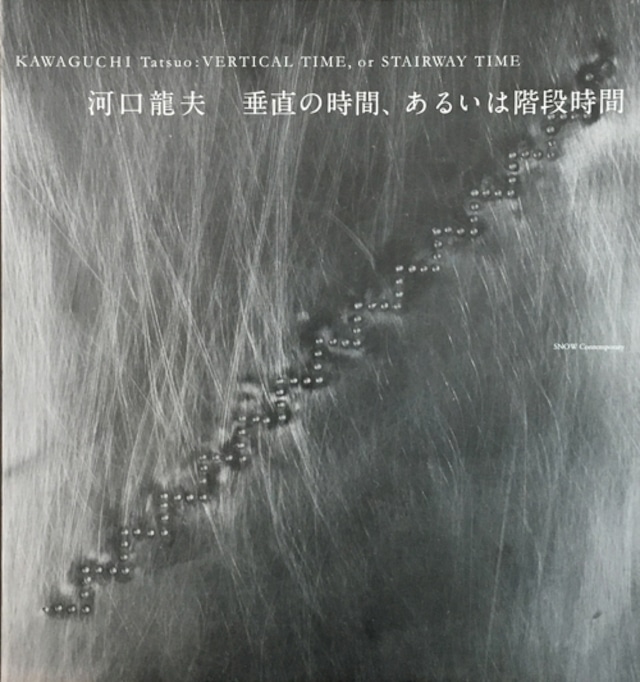
“Vertical Time, or Stairway Time” / 『垂直の時間、あるいは階段時間』
¥4,400
[カタログ] 仕様:29 x 31 cm、56ページ、モノクロ+カラー、ED500 掲載作品:河口龍夫『垂直の時間、あるいは階段時間』展より89点 テキスト:水沢 勉、河口龍夫 撮影:斎藤さだむ、木奥恵三 編集:窪田研二、石水美冬 デザイン:細谷勇作 発行:SNOW Contemporary 河口龍夫「垂直の階段、あるいは階段時間」(2014年12月14日)より抜粋 階段と芸術について書き始めたが、果たして階段と芸術は関係があるのか全く無関係であるのか定かではない。あえて階段を上り下りのための、つまり空間の上下移動をする機能と実利的にとらえるだけでなく、階段を彫刻ととらえ、あるいはもう少し広く芸術として比喩的にとらえてみることもあながち無意味なことだけではなかろうと考えたのである。断るまでもないが、このことは単純なレディメイド論を反芻しようとしているのではない。 階段は上ったり下りたりする時、その行動を起こす人の体重が移動することになるが、同時に、当然のことながら視点の移動を伴うことを忘れてはならないのではないかと考える。普通、歩行する時平坦な道では視線は平行移動を行うが、坂道や階段では視線は上下移動を行う。水平移動の場合の1メートルの移動は1メートルの視界の変化を伴うのが常であるが、だとすれば1メートルの上下移動においても上下に視界が変化するはずである。視界の水平移動と視界の上下移動のにはただ単に移動の変化に伴う視界の変化だけなのであろうか。なるほどその通りだとも言える。だが水平移動と上下移動の場合、微妙な大地との関係の在り様に変化があるようにも思われる。水平移動の場合は大地との関係は平行移動であるが、上下移動の場合は大地との関係は近づいたり離れたりすることになる。その大地との関係の考察においても、水平移動の場合には水平時間が流れる。とすれば、上下移動の場合には垂直時間といってよいような階段時間が占有するとみるのはどうだろうか。このように階段はその微妙な変化を思考するのに格好の装置・形態なのではなかろうか。階段において上り下りするという機能を残しながら、精神的な対象物とするために階段を階段のまま彫刻、もう少し広く芸術とすること。あるいは芸術として感じさせるように創造することは可能なのだろうか。 *掲載作品に関しては下記までお問い合わせください。 http://snowcontemporary.com/contact.html [Catalogue] 56 pages, 29 x 31 cm, b/w and color, ED500 89 Works by Tatsuo Kawaguchi from the “Vertical Time, or Stairway Time” exhibition in 2015. Essays by Tatsuo Kawaguchi and Tsutomu Mizusawa (only in Japanese) Photo by Sadam Saito, Keizo Kioku Edited by Kenji Kubota, Mifuyu Ishimizu Designed by Yusaku Hosoya Published by SNOW Contemporary Excerpt from Tatsuo Kawaguchi "Vertical Time, or Stairway Time" (December 14th, 2014) I started writing about relationship between stairways and art, but no one knows at all whether any relation between stairways and art exist. I am not only interested in understanding stairways with its actual function of going up and down, but also would like to understand it as a sculpture, or even more broadly, as a figurative manner of art which I believe has some point to say. Obviously, I am not simply reconsidering the concept of Ready-Made here. When you go up and down a stairway, the weight of the person moves, but we also need to remember that our sights move at the same time here. When we normally walk on a flat road, our sight moves horizontally, but going up and down hills or stairways would make our sights go through a vertical move. Moving horizontally one meter would normally result as a one-meter move of sight - therefore, a one-meter vertical move should accordingly shift our sights vertically also. Do horizontal and vertical sight movements simply differentiate within the manner of movement change and sight change. Such could be true in away. However, when we speak of horizontal movements and vertical movements, I feel there is a slight difference within its relationship with the ground. A Horizontal move has a parallel relationship with the ground, however, a vertical move would mean being closer or further from the ground. Also, when we think of the relationship between the ground, a horizontal move would have a horizontal time move. If so, would it be that a vertical movement would contain stairway time, such as vertical time? Likewise, I believe stairways are a perfect motif/device upon considering slight changes. Leaving its function of going up and down, a stairway could also be a sculpture to reconsider our minds and more broadly enhance itself as art. Or perhaps, create one enabling itself as art. *for more information http://snowcontemporary.com/artist/kawaguchi_tatsuo.html *Please feel free to ask us about the artworks shown in the catalogue. http://snowcontemporary.com/en/contact.html Please do not proceed with the payment if you live outside of the EMS transportable area (https://www.post.japanpost.jp/int/ems/country/all_en.html). Please let us know the address to be shipped and contact "[email protected]" first for the estimate of the shipment fee. Import duties and taxes may be applied upon customs clearance into your country. In such cases, the recipient of the item will be responsible for those fees. Please pay these costs directly to the delivery agents or the customs office upon delivery. Additionally, taxes and duties differ by country. Please contact the customs office in your country for details.
-

“From 172800 Seconds in 1971 to 345600 Seconds in 2021” / 『1971年の172800秒から2021年の345600秒へ』
¥1,100
[カタログ] 仕様:B5サイズ 18.2 x 25.7 cm、48ページ、モノクロ 掲載作品:河口龍夫『1971年の172800秒から2021年の345600秒へ』展より58点 テキスト:河口龍夫、金子智太郎 撮影:藤島亮 編集:窪田研二、石水美冬、金子智太郎 デザイン:川村格夫 発行:SNOW Contemporary 河口龍夫「1971年の172800秒から2021年の345600秒へ」(2021年1月11日)より抜粋 最初の段階では、「172800 秒展」の再現を考えていた。しかし、再現可能なすべての機材を整えたとしても、1971年の172800秒という時間そのものの再現は不可能である。当時制作した絵画や 彫刻であれば2021 年に見ることが可能である。しかし、この作品の成立に不可欠なものは物質ではなく時間そのものだからである。時間は「時間の不可逆性」によって成立する。そのため展覧会の内容を1971年の「172800 秒展」から2021年の「345600秒展」とした所以である。 1971年に開催された「172800 秒展」は、あたかも「時のブーメラン」のように 50 年後の我々の手元に戻ってきた。2021 年に再度投げられた「時のブーメラン」は、矛盾するようであるが「時間の不可逆性」に逆らいながら、何処に飛んでゆくのであろうか。おそらくそこには私は存在しない。 はたして誰が受け止めるのであろうか。 封印された光景と音は、あたかも見ることが不可能な「時間の客体化」であったかのようである。 そして今再び我々は芸術における時間について、問い続けることになるのである。時間よ、止まるなとつぶやきながら。 *掲載作品に関しては下記までお問い合わせください。 http://snowcontemporary.com/contact.html [Catalogue] 48 pages, 18.2 x 25.7 cm, b/w 89 Works by Tatsuo Kawaguchi from the “From 172800 Seconds in 1971 to 345600 Seconds in 2021” exhibition in 2021. Essays by Tatsuo Kawaguchi and Tomotaro Kaneko (only in Japanese) Photo by Ryo Fujishima Edited by Kenji Kubota, Mifuyu Ishimizu, Tomotaro Kaneko Designed by Tadao Kawamura Published by SNOW Contemporary Excerpt from Tatsuo Kawaguchi "From 172800 Seconds in 1971 to 345600 Seconds in 2021" (January 11th, 2021) Initially I had planned to exactly reproduce “172800 Second Exhibition.” However, even if I could find all the necessary devices to enact it again, it is not possible to reproduce the time itself, namely the 172800 seconds back in 1971. If it were a piece of painting or sculpture, it would appear as it was made at that time, even in 2021. However, the indispensable component of this work is time itself, not matter. Time arises based on the “irreversibility of time.” Therefore, I decided to change the content of this exhibition, “From 172800 Seconds in 2021 to 345600 Seconds in 2021.” The “172800 Second Exhibition” held in 1971 has come back to our hands after 50 years just like a “boomerang of time.” I wonder towards what destination the “boomerang of time” thrown again in 2021 would be traveling in against the “irreversibility of time,” as paradoxical as that may sound. Perhaps, I might not exist in the place it will come back to one day. I wonder who would receive it. The sealing of sights and sounds could be thought of as an “objectification of time,” which we can never see. Today, we are about to revisit the question of time in art endlessly. As we mutter: “Time, don’t you stop.” *for more information http://snowcontemporary.com/artist/kawaguchi_tatsuo.html *Please feel free to ask us about the artworks shown in the catalogue. http://snowcontemporary.com/en/contact.html Please do not proceed with the payment if you live outside of the EMS transportable area (https://www.post.japanpost.jp/int/ems/country/all_en.html). Please let us know the address to be shipped and contact "[email protected]" first for the estimate of the shipment fee. Import duties and taxes may be applied upon customs clearance into your country. In such cases, the recipient of the item will be responsible for those fees. Please pay these costs directly to the delivery agents or the customs office upon delivery. Additionally, taxes and duties differ by country. Please contact the customs office in your country for details.
-

青い液体
¥495,000
SOLD OUT
title:Blue liquid / 青い液体 artist:KOREHIKO HINO / 日野之彦 year:2024 media:Oil on canvas / キャンバスに油彩 size:41 x 41 cm *本作品は店頭併売品につき、品切れの場合にはご注文をキャンセルさせて頂く場合がございます。予めご了承ください。 1976年 石川県輪島市生まれ。東京都在住。 うつろに見開いた目に半開きの口、幼児的なポーズをとった言いようのない不安定な人物像を描く。 圧倒的な迫力と同時に、技術に裏付けされた精緻な描写、デフォルメされた細部は絶妙のアンバランスさを醸しだし、 現代社会で誰もが抱えている社会への不安や虚無、狂気といった時代の空気を正確に表現することに成功している。 Born in Ishikawa, Japan in 1976. Lives and works in Tokyo. He paints oddly unbalanced posed portrait, half-naked with briefs. Shocking at first glance, but his transcendent painting certainly captures and mirrors the current precarious state of Japanese society and eventually gives us the shivers with its acute representation of our circumstances. for more information : http://snowcontemporary.com/artist/hino_korehiko.html Please do not proceed with the payment if you live outside of the EMS transportable area (https://www.post.japanpost.jp/int/ems/country/all_en.html). Please let us know the address to be shipped and contact "[email protected]" first for the estimate of the shipment fee. Import duties and taxes may be applied upon customs clearance into your country. In such cases, the recipient of the item will be responsible for those fees. Please pay these costs directly to the delivery agents or the customs office upon delivery. Additionally, taxes and duties differ by country. Please contact the customs office in your country for details.
-

晴れ
¥385,000
title:Sunny / 晴れ artist:KOREHIKO HINO / 日野之彦 year:2024 media:Oil on canvas / キャンバスに油彩 size:31.8 x 41 cm *本作品は店頭併売品につき、品切れの場合にはご注文をキャンセルさせて頂く場合がございます。予めご了承ください。 1976年 石川県輪島市生まれ。東京都在住。 うつろに見開いた目に半開きの口、幼児的なポーズをとった言いようのない不安定な人物像を描く。 圧倒的な迫力と同時に、技術に裏付けされた精緻な描写、デフォルメされた細部は絶妙のアンバランスさを醸しだし、 現代社会で誰もが抱えている社会への不安や虚無、狂気といった時代の空気を正確に表現することに成功している。 Born in Ishikawa, Japan in 1976. Lives and works in Tokyo. He paints oddly unbalanced posed portrait, half-naked with briefs. Shocking at first glance, but his transcendent painting certainly captures and mirrors the current precarious state of Japanese society and eventually gives us the shivers with its acute representation of our circumstances. for more information : http://snowcontemporary.com/artist/hino_korehiko.html Please do not proceed with the payment if you live outside of the EMS transportable area (https://www.post.japanpost.jp/int/ems/country/all_en.html). Please let us know the address to be shipped and contact "[email protected]" first for the estimate of the shipment fee. Import duties and taxes may be applied upon customs clearance into your country. In such cases, the recipient of the item will be responsible for those fees. Please pay these costs directly to the delivery agents or the customs office upon delivery. Additionally, taxes and duties differ by country. Please contact the customs office in your country for details.
-

雨上がり
¥385,000
title:After the rain / 雨上がり artist:KOREHIKO HINO / 日野之彦 year:2024 media:Oil on canvas / キャンバスに油彩 size:31.8 x 41 cm *本作品は店頭併売品につき、品切れの場合にはご注文をキャンセルさせて頂く場合がございます。予めご了承ください。 1976年 石川県輪島市生まれ。東京都在住。 うつろに見開いた目に半開きの口、幼児的なポーズをとった言いようのない不安定な人物像を描く。 圧倒的な迫力と同時に、技術に裏付けされた精緻な描写、デフォルメされた細部は絶妙のアンバランスさを醸しだし、 現代社会で誰もが抱えている社会への不安や虚無、狂気といった時代の空気を正確に表現することに成功している。 Born in Ishikawa, Japan in 1976. Lives and works in Tokyo. He paints oddly unbalanced posed portrait, half-naked with briefs. Shocking at first glance, but his transcendent painting certainly captures and mirrors the current precarious state of Japanese society and eventually gives us the shivers with its acute representation of our circumstances. for more information : http://snowcontemporary.com/artist/hino_korehiko.html Please do not proceed with the payment if you live outside of the EMS transportable area (https://www.post.japanpost.jp/int/ems/country/all_en.html). Please let us know the address to be shipped and contact "[email protected]" first for the estimate of the shipment fee. Import duties and taxes may be applied upon customs clearance into your country. In such cases, the recipient of the item will be responsible for those fees. Please pay these costs directly to the delivery agents or the customs office upon delivery. Additionally, taxes and duties differ by country. Please contact the customs office in your country for details.
-

ねじれる顔
¥242,000
title:Twisted face / ねじれる顔 artist:KOREHIKO HINO / 日野之彦 year:2023 media:Pencil on paper / 紙に鉛筆 size:47.8 x 30.8 cm *値段には額装代も含まれます。 *本作品は店頭併売品につき、品切れの場合にはご注文をキャンセルさせて頂く場合がございます。予めご了承ください。 1976年 石川県輪島市生まれ。東京都在住。 うつろに見開いた目に半開きの口、幼児的なポーズをとった言いようのない不安定な人物像を描く。 圧倒的な迫力と同時に、技術に裏付けされた精緻な描写、デフォルメされた細部は絶妙のアンバランスさを醸しだし、 現代社会で誰もが抱えている社会への不安や虚無、狂気といった時代の空気を正確に表現することに成功している。 Born in Ishikawa, Japan in 1976. Lives and works in Tokyo. He paints oddly unbalanced posed portrait, half-naked with briefs. Shocking at first glance, but his transcendent painting certainly captures and mirrors the current precarious state of Japanese society and eventually gives us the shivers with its acute representation of our circumstances. for more information : http://snowcontemporary.com/artist/hino_korehiko.html Please do not proceed with the payment if you live outside of the EMS transportable area (https://www.post.japanpost.jp/int/ems/country/all_en.html). Please let us know the address to be shipped and contact "[email protected]" first for the estimate of the shipment fee. Import duties and taxes may be applied upon customs clearance into your country. In such cases, the recipient of the item will be responsible for those fees. Please pay these costs directly to the delivery agents or the customs office upon delivery. Additionally, taxes and duties differ by country. Please contact the customs office in your country for details.
-

Evolving person / 進化する人
¥440,000
SOLD OUT
title:Evolving person / 進化する人 artist:SHU YONEZAWA / 米澤 柊 year:2024 media:Panel, Graphite, Acrylic paint / 木製パネル、グラファイト、アクリル size:116.7 x 72.7 cm *本作品は店頭併売品につき、品切れの場合にはご注文をキャンセルさせて頂く場合がございます。予めご了承ください。 1999年 東京都生まれ。 アーティスト、アニメーター。現在のデジタルアニメーションにおけるキャラクターの身体性と、現実空間の生き物が持っている心の身体性と感情について、またそれらアニメーションが生きる空間の空気を制作している。 Born in Tokyo in 1999. Artist and animator. Interested in the physicality of characters in today’s digital animation and the physicality of the mind and emotions of living creatures in real space. Also creates the atmosphere of the space in which these animations live. for more information : http://snowcontemporary.com/artist/yonezawa_shu.html Please do not proceed with the payment if you live outside of the EMS transportable area (https://www.post.japanpost.jp/int/ems/country/all_en.html). Please let us know the address to be shipped and contact "[email protected]" first for the estimate of the shipment fee. Import duties and taxes may be applied upon customs clearance into your country. In such cases, the recipient of the item will be responsible for those fees. Please pay these costs directly to the delivery agents or the customs office upon delivery. Additionally, taxes and duties differ by country. Please contact the customs office in your country for details.
-

From Now / これから
¥198,000
title:From Now / これから artist:SHU YONEZAWA / 米澤 柊 year:2024 media:Lambda print *with frame / ラムダプリント *額付 size:72.8 x 51.5 cm *本作品は店頭併売品につき、品切れの場合にはご注文をキャンセルさせて頂く場合がございます。予めご了承ください。 1999年 東京都生まれ。 アーティスト、アニメーター。現在のデジタルアニメーションにおけるキャラクターの身体性と、現実空間の生き物が持っている心の身体性と感情について、またそれらアニメーションが生きる空間の空気を制作している。 Born in Tokyo in 1999. Artist and animator. Interested in the physicality of characters in today’s digital animation and the physicality of the mind and emotions of living creatures in real space. Also creates the atmosphere of the space in which these animations live. for more information : http://snowcontemporary.com/artist/yonezawa_shu.html Please do not proceed with the payment if you live outside of the EMS transportable area (https://www.post.japanpost.jp/int/ems/country/all_en.html). Please let us know the address to be shipped and contact "[email protected]" first for the estimate of the shipment fee. Import duties and taxes may be applied upon customs clearance into your country. In such cases, the recipient of the item will be responsible for those fees. Please pay these costs directly to the delivery agents or the customs office upon delivery. Additionally, taxes and duties differ by country. Please contact the customs office in your country for details.
-

Snow Thunder / 雪雷
¥242,000
title:Snow Thunder / 雪雷 artist:SHU YONEZAWA / 米澤 柊 year:2024 media:Lambda print *with frame / ラムダプリント *額付 size:72.8 x 51.5 cm *本作品は店頭併売品につき、品切れの場合にはご注文をキャンセルさせて頂く場合がございます。予めご了承ください。 1999年 東京都生まれ。 アーティスト、アニメーター。現在のデジタルアニメーションにおけるキャラクターの身体性と、現実空間の生き物が持っている心の身体性と感情について、またそれらアニメーションが生きる空間の空気を制作している。 Born in Tokyo in 1999. Artist and animator. Interested in the physicality of characters in today’s digital animation and the physicality of the mind and emotions of living creatures in real space. Also creates the atmosphere of the space in which these animations live. for more information : http://snowcontemporary.com/artist/yonezawa_shu.html Please do not proceed with the payment if you live outside of the EMS transportable area (https://www.post.japanpost.jp/int/ems/country/all_en.html). Please let us know the address to be shipped and contact "[email protected]" first for the estimate of the shipment fee. Import duties and taxes may be applied upon customs clearance into your country. In such cases, the recipient of the item will be responsible for those fees. Please pay these costs directly to the delivery agents or the customs office upon delivery. Additionally, taxes and duties differ by country. Please contact the customs office in your country for details.
-

Aiyu seeds / 愛玉種子
¥36,300
Aiyu seeds / 愛玉種子 artist:Yuriko Asano / 浅野友理子 year:2022 ED:20 media:Woodblock print(Indian Ink and Hand-colored)*with frame / 木版画(墨、手彩色)*額付 sheet size:29.7 x 21.0 cm image size:22.2 x 14.8 cm *木版画のため作品に多少のしわがよっています。その点をご承知おきの上でご注文ください。 *The print is slightly wrinkled.Please order with this in mind. 1990年 宮城県生まれ。 浅野友理子は、その土地の食文化や植物の利用法を学ぶために様々な土地を訪ね、出会った人々とのやりとりや自身の体験をなぞり、その土地で受け継がれてきたものを記録するように絵画を制作しています。それらの作品は、単なる植物画にとどまらず、土地に長く伝わる知恵や知識に着目し、現代社会で失われつつある人と自然との共生や、人間以外の生き物に対する視点、生命の循環、あるいは女性の労働など、きわめて現代的な問題意識を内包しています。そしてその色彩豊かで生命力にあふれる絵画作品を通じ、浅野はこの豊かな世界を祝福しているのです。 Born in Miyagi in 1990. Yuriko Asano visits various places to learn about local food culture and usage of plants, tracing her own experiences and interactions with the people she meets, and creates paintings as if she were recording what has been handed down in the local area. These works are not mere botanical paintings, but rather focus on the wisdom and knowledge that has long been passed down from generation to generation in the local area. They also include an awareness of contemporary issues such as the symbiosis between humans and nature, which is being lost in modern society, the perspective on non-human lives, the cycle of life, and women’s labor. Through her colorful and vital paintings, Asano is trying to celebrate this rich world. for more information: http://snowcontemporary.com/artist/asano_yuriko.html Please do not proceed with the payment if you live outside of the EMS transportable area (https://www.post.japanpost.jp/int/ems/country/all_en.html). Please let us know the address to be shipped and contact "[email protected]" first for the estimate of the shipment fee. Import duties and taxes may be applied upon customs clearance into your country. In such cases, the recipient of the item will be responsible for those fees. Please pay these costs directly to the delivery agents or the customs office upon delivery. Additionally, taxes and duties differ by country. Please contact the customs office in your country for details.